Throughout my ten-year partnership with SHELF Studio, I’ve helped the team shepherd countless fledgling CPGs into true brandom – from naming to expo and onto social. These are a few of my favorite things.
FATCO
Challenge: Cassy Burnside’s passion for clean eating inspired her business – making clean skincare products. When she came to SHELF, she was already having great success with a secret ingredient: beef fat! Although the company was on trajectory, it needed a facelift to attract more of a unisex audience and resonate with the larger Paleo community.
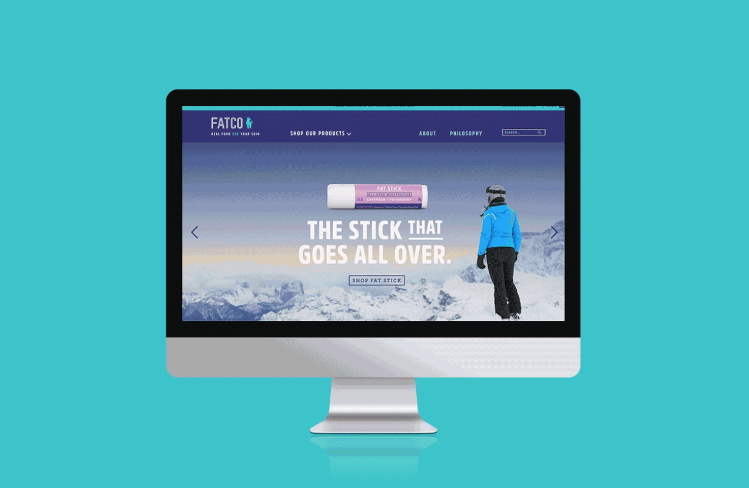
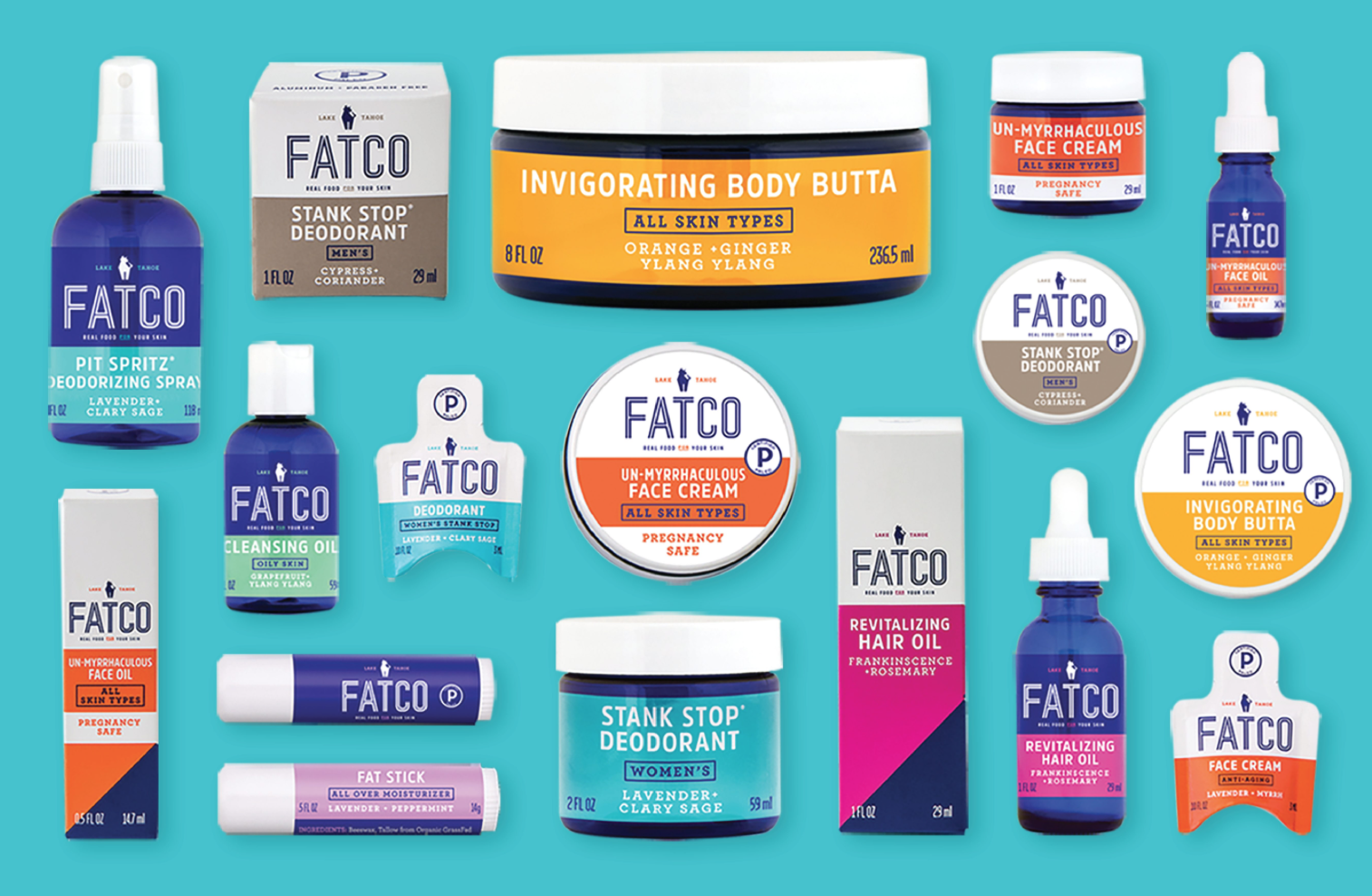
Approach: Working with with the team at SHELF Studio, we rebranded the brand from nose to tail – beginning with the name. FATCO was born! We completed a logo design and then moooved onto packaging, expo booth, and website. For the packaging, we created a clean, hierarchical system to allow for a fresh on-shelf presence, with navy bottles and color pop per product line. If you asked us, we really made this fat lady sing!
SWEET BANDIT
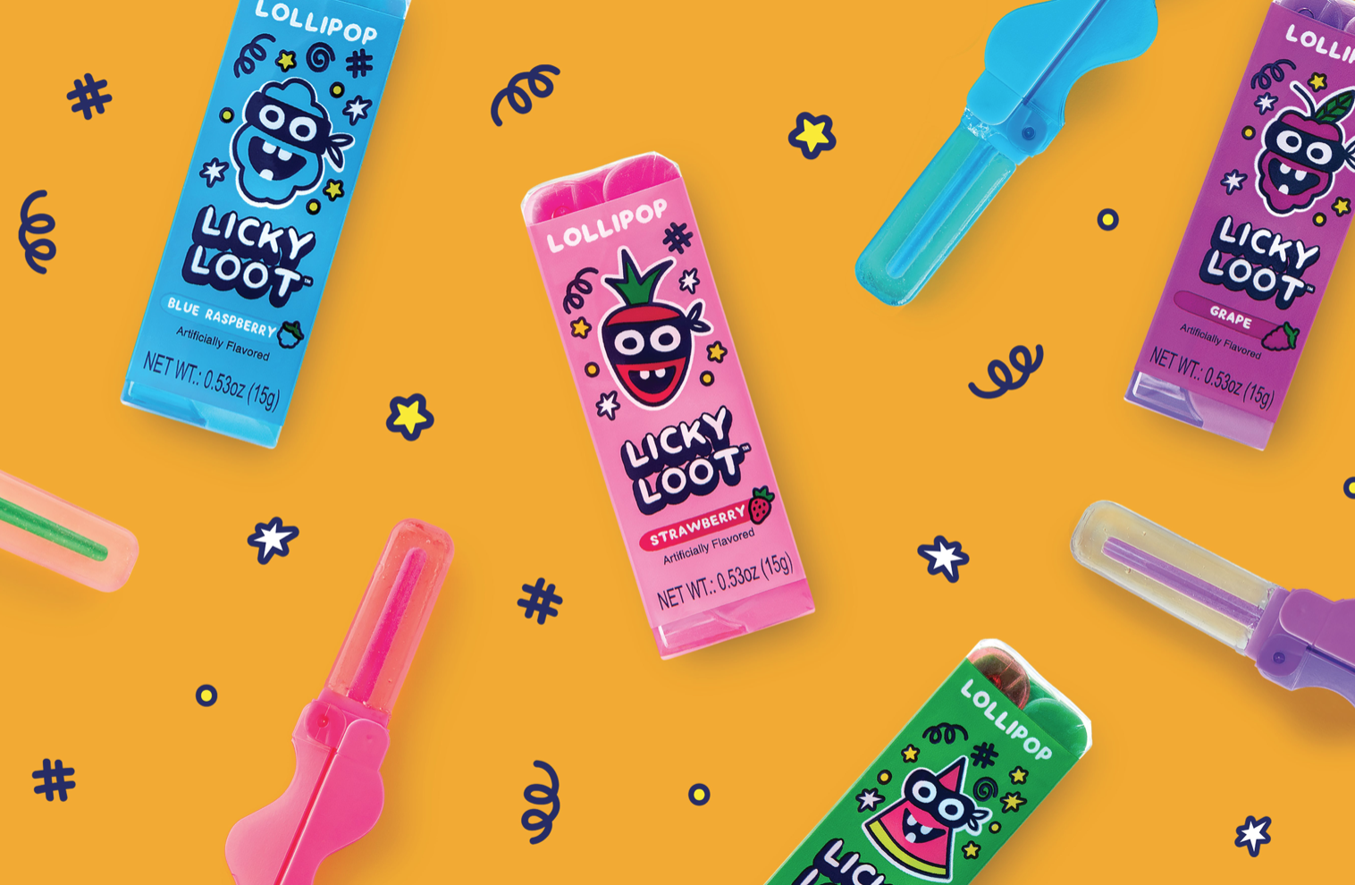
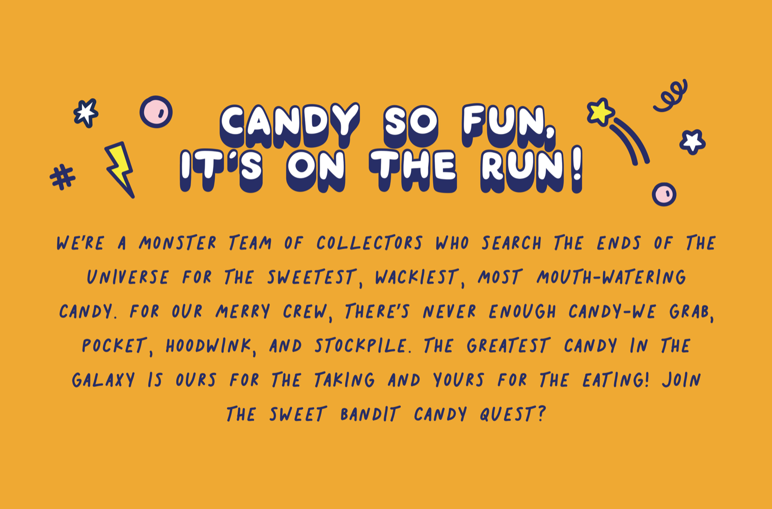
Challenge: Brand Challenge A new business venture for a family with a legacy of candy making in China. What became known as Sweet Bandit came to us with a few whimsical candies and a big ask. Name the company, create the packaging, tell their story, and develop a marketing strategy. More than we can chew? Nope! And luckily for them, we have a sweet tooth.
Approach: We started off with in-store focus groups and market tests with more than 60 kids to gauge what excited them in the candy aisle. We even went beyond that and tracked trends in toys and kids fashion. Then we went to the literal drawing board and created tons of illustration concepts based on themes like space, monsters, shapes, superheroes, and bandits. The final concept was a mishmash of all the things we liked from every category. Because sometimes there doesn’t need to be a ton of overthinking when it comes to branding. Sometimes it’s just what makes you smile. Or makes your mouth water.
CECE’S VEGGIE NOODLE CO.
Challenge: Creator Mason Arnold saw a trend in pre-packaged vegetables. Dietary restrictions within his own family and his love of produce inspired Mason to create the Veggie Noodle Co. SHELF Studio was enlisted to do what we do best- create a look as delicious as the product itself. The challenge was to remove the stigma that vegetables are boring and build a brand as fun as it’s creator.
Approach: Playing on Mason’s personality was the way to go with his fun and simple approach to this new product. We had a lot of fun creating a clean look with touches of hilarity and unscripted moments. A clean color palette, enabled us to let the product speak for itself. Focusing on the fun of spiralized vegetables and their natural twisted behavior set the tone for a lot of funny copy, and non-stop giggles throughout the process.
ARAZA
Challenge: Araza came to us with truly beautiful beauty products, but their brand needed a bit of a glow-up. For them, it was all about giving their online presence a cosmetic upgrade – from the inside out. They wanted the same online pop as the radiant customers who use their makeup.
Approach: Beauty isn’t about glamor shots. Beauty is attitude. So we gave them an attitude in the form of art and copy. We visualized Araza as a hip friend who wants you to look your best – translating that into a vibrant, hydrating logo and an authentic voice on package and web. We also helped launch their website and maintain their online visual language. They’re a knockout – on screen and skin.
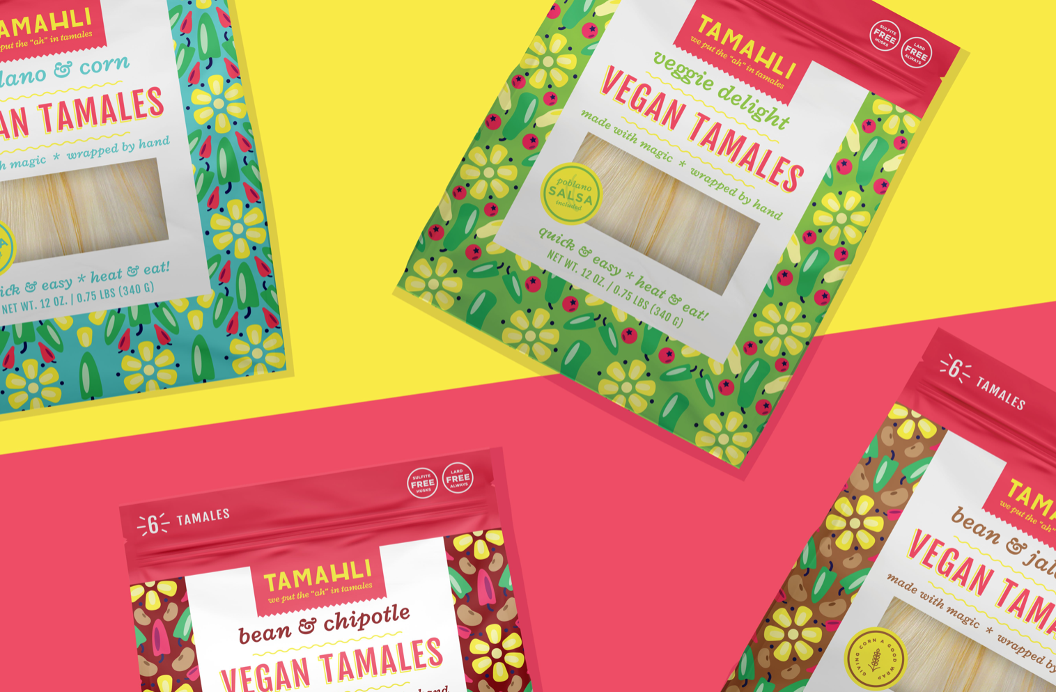
TAMAHLI
Challenge: When our first Mexico City-based client came to SHELF, the product didn’t have a name or label. But up until that point, the product was good enough to stand on its own – hand-made tamales, cooked in small batches for peak flavor. The trick was to communicate that these tamales were made with no lard, no fillers, no greasy orange bottoms! There was also a big ask to incorporate Mexican culture into the look and feel.
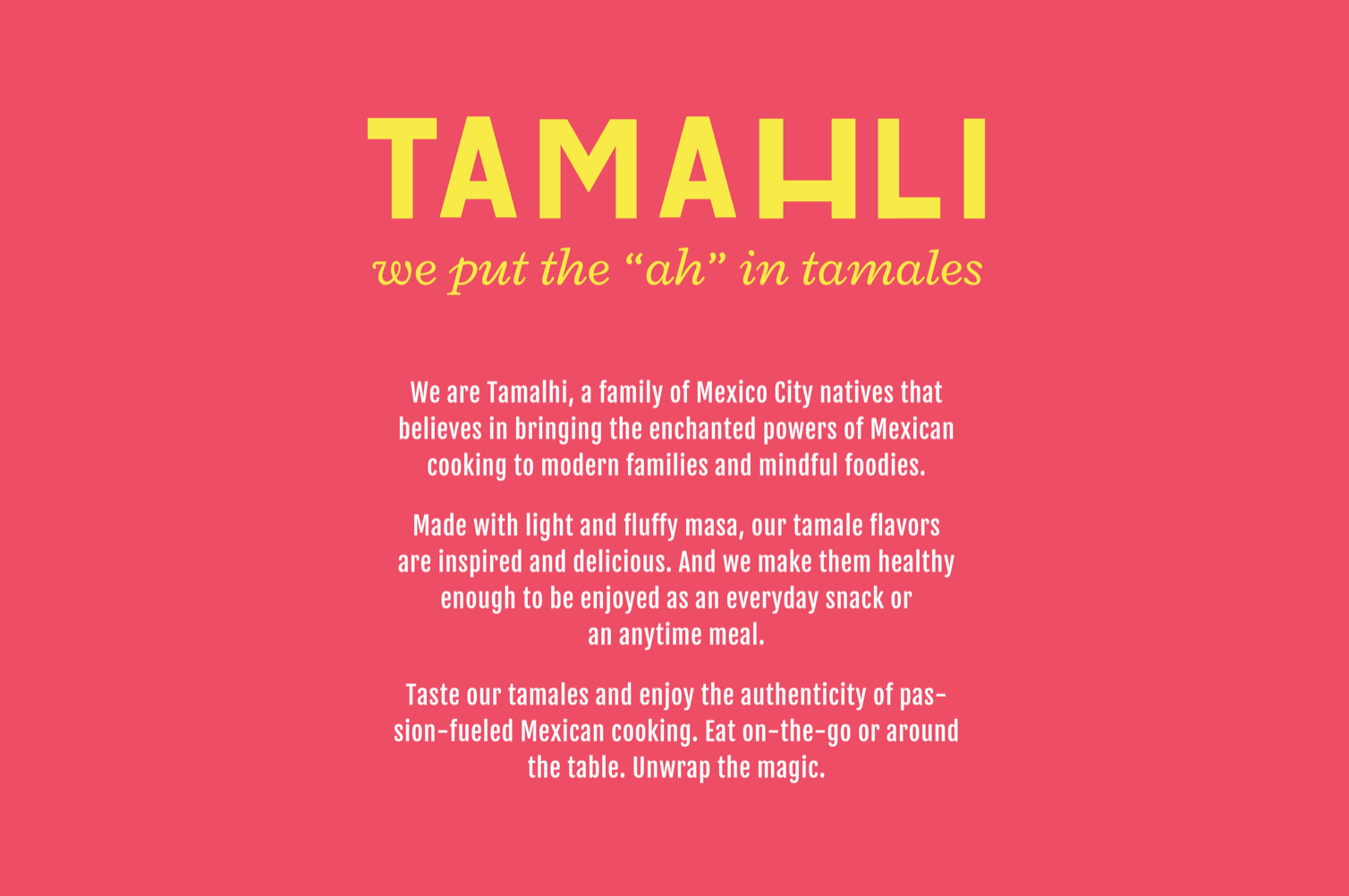
Approach: We also named the company “Tamahli” because they put the “ah” in tamale [DAMN, I WROTE THAT]. For the look, the brilliant designers brought culture to the forefront – creating color palettes and rich patterns steeped in the modern Mexican experience. And in the art and copy, we communicated the enchanted powers of Mexican cooking – especially these healthily, innovative tamales, fully wrapped in tradition.
